עברית
Motion
AccessibilityPrivacy
Case study03 / 15July 2026 – present

console-ui

One design system, a shared component library, for every admin screen I build.
Role
Designer and sole developer
Organisation
Personal project
Period
July 2026 – present
Status
In active development
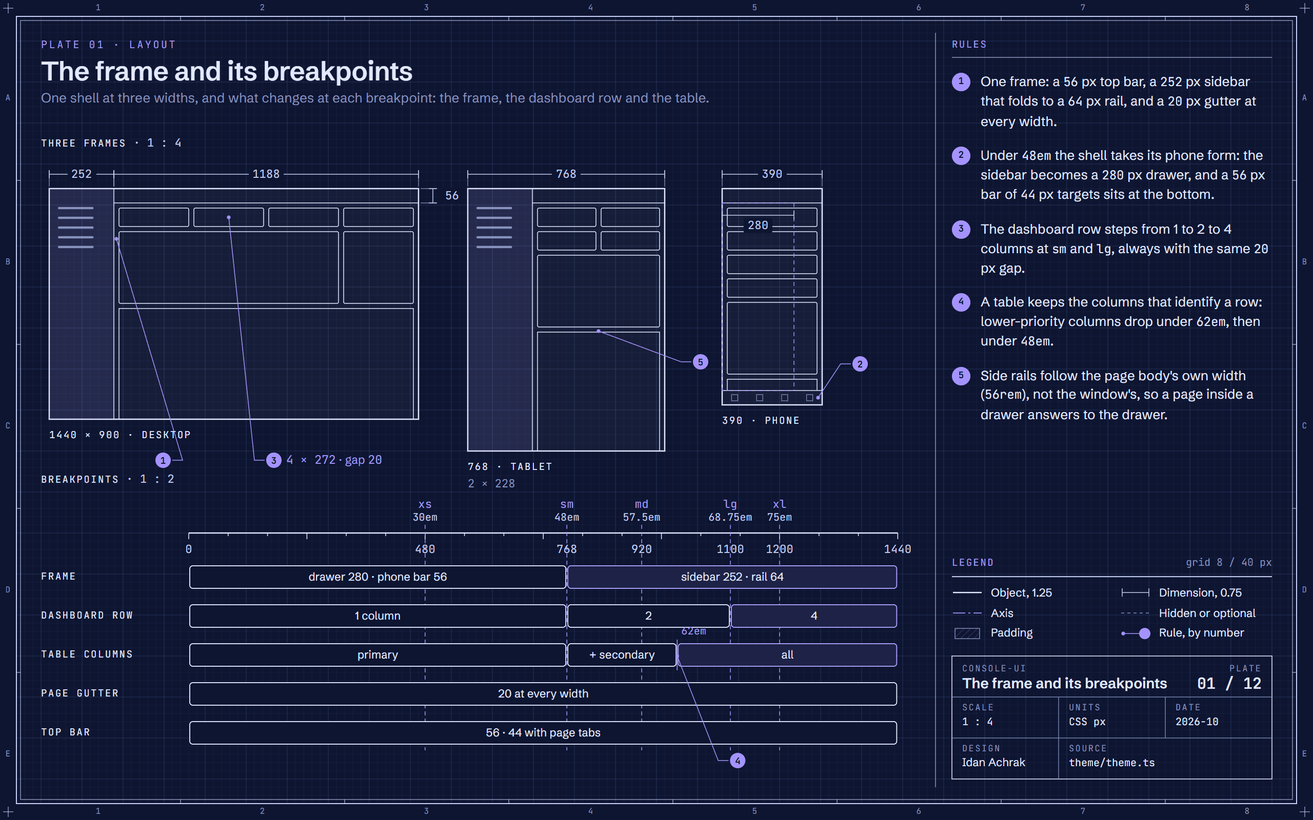
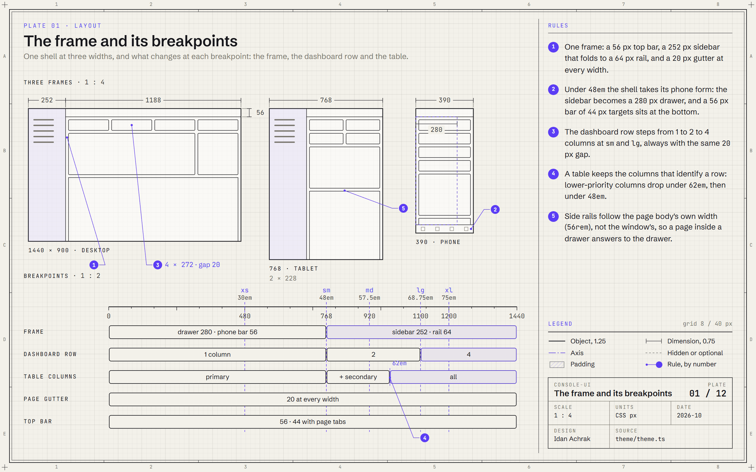
Blueprint of the console-ui shell drawn at desktop, tablet and phone widths, above a ruler of its five breakpoints and what each one changes.Blueprint of the console-ui shell drawn at desktop, tablet and phone widths, above a ruler of its five breakpoints and what each one changes.
Plate 01The frame and its breakpointsOne shell at 1440, 768 and 390 px: a 56 px top bar, a 252 px sidebar that becomes a drawer under 48em, and a 20 px gutter at every width.

01 / The challenge

Most of what I build is a console for the people who run something: tables, forms, dashboards and settings, in Hebrew and in English. Every project used to settle the same questions again: the spacing, the contrast, how dense a table is, what a focused control looks like, and how the whole screen turns around in Hebrew.

I wanted those answers decided once, written down as numbers, and checked by tests, so that a new screen starts from rules and not from taste.

  • The same layout questions in every project
  • Contrast checked by eye, if at all
  • Right to left added late, and only partly
  • Small details that drift from screen to screen

02 / What I built

A component library in two layers. The components are the skeleton: they decide what exists, how it behaves with a keyboard and a screen reader, and that it is accessible. A design language decides how it looks and how big it is, and it is plain data: colours for each scheme, the spacing, type, radius and shadow scales, the size of every control and of the shell. The library ships two languages, a cool console and a warm atelier, and switches between them live.

Every number has a reason, and the reasons are written into the code and the documentation: why a field's edge is the grey it is, why a nested sidebar row moves in by 16 pixels, why a hint sits under its field. It began in July 2026 from an open-source admin layout, Colorlib's Gentelella, moved to React and Mantine; since then I have rebuilt it, rule by rule, into a design system of my own.

How it came together

  1. 2026-07A component library and its showcaseI move an open-source admin layout (Gentelella) to React and Mantine, as a component library and a showcase app.
  2. 2026-08One axis, one catalogueThe sidebar gets its fixed icon axis, and the component catalogue is written so people and AI agents reuse before they build.
  3. 2026-10Measured to WCAG AAEvery text tier, control edge, chart series and state mark is measured, and the browser tests scan every overlay open.
  4. 2026-10A second design languageAtelier, warm cream and wine, ships over the same skeleton, measured to WCAG AA and switchable live.
  5. 2026-10Settings that drill inThe settings dialog turns its rail into a list it drills into when its own box is narrow.

03 / Highlights

01

One skeleton, two design languages

Components own behaviour, keyboard and accessibility; a language owns colour and size, as data. A third language is a file, not a fork.

02

Every colour measured

Text stays easy to read on every surface it can land on, a hovered row included: at least 4.5:1 contrast, the level the accessibility standard asks for, and 3:1 for control edges and chart marks. The tests compute the ratios from the design values.

03

Density with floors

Three density levels, each setting four things: spacing, control size, text size and line height. No control goes under 24 pixels, and 36 when the reader asks for large targets.

04

Right to left from one stylesheet

Layouts are written as start and end, never left and right, so Hebrew is the same code. Figures with a sign or a unit stay left to right, and only icons that point mirror.

05

A sidebar on one axis

Every icon, the logo and the avatar sit on one axis 32 pixels in, the centre of the folded sidebar, so nothing jumps when it folds.

06

Settings for the reader

Reduced motion, high contrast, large targets, text spacing, always-visible focus, underlined links and notifications that stay: each one held to the numbers it promises.

07

A showcase of every component

A live catalogue that renders every component with real props, and demo screens on sample data, tested in both languages, both schemes and both directions.

04 / Plates

12 plates · open any one to read it at full size · sample data

Design noteThe plates below are console-ui drawn as a specification: the shell and its breakpoints, the sidebar's axis, spacing and density, the type scale, the button, the form field, the table, dialogs and drawers, contrast, right to left, the small details and a full dashboard. Every number on them comes from the code.
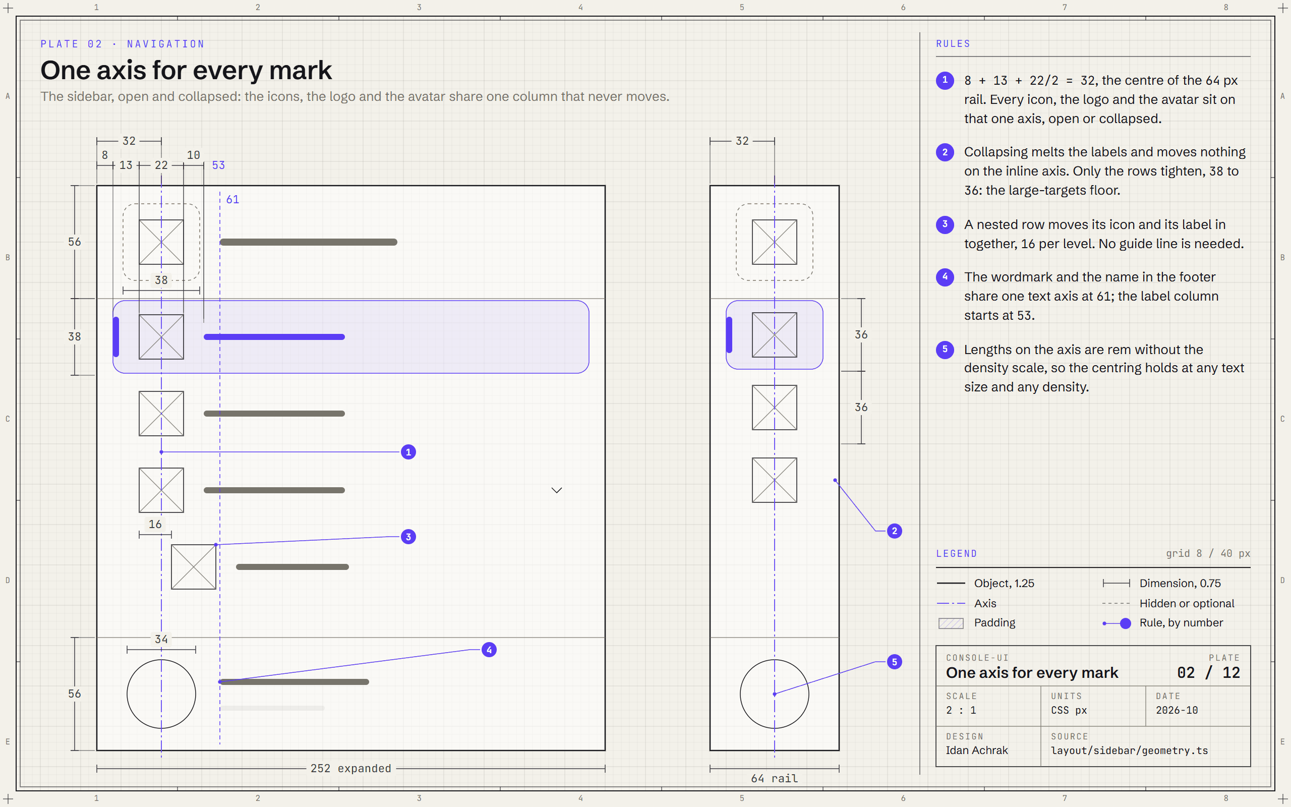
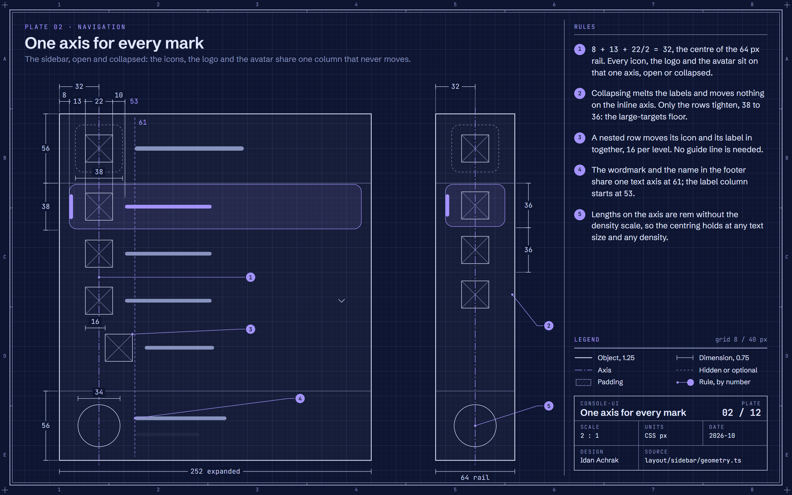
Blueprint of the console-ui sidebar, expanded at 252 px and collapsed to a 64 px rail, with dimension lines showing every icon, the logo and the avatar centred on one axis at 32 px.Blueprint of the console-ui sidebar, expanded at 252 px and collapsed to a 64 px rail, with dimension lines showing every icon, the logo and the avatar centred on one axis at 32 px.
Plate 02One axis for every markThe sidebar is built on one axis: 8 + 13 + 11 = 32, the centre of the 64 px rail, so nothing jumps when it collapses.
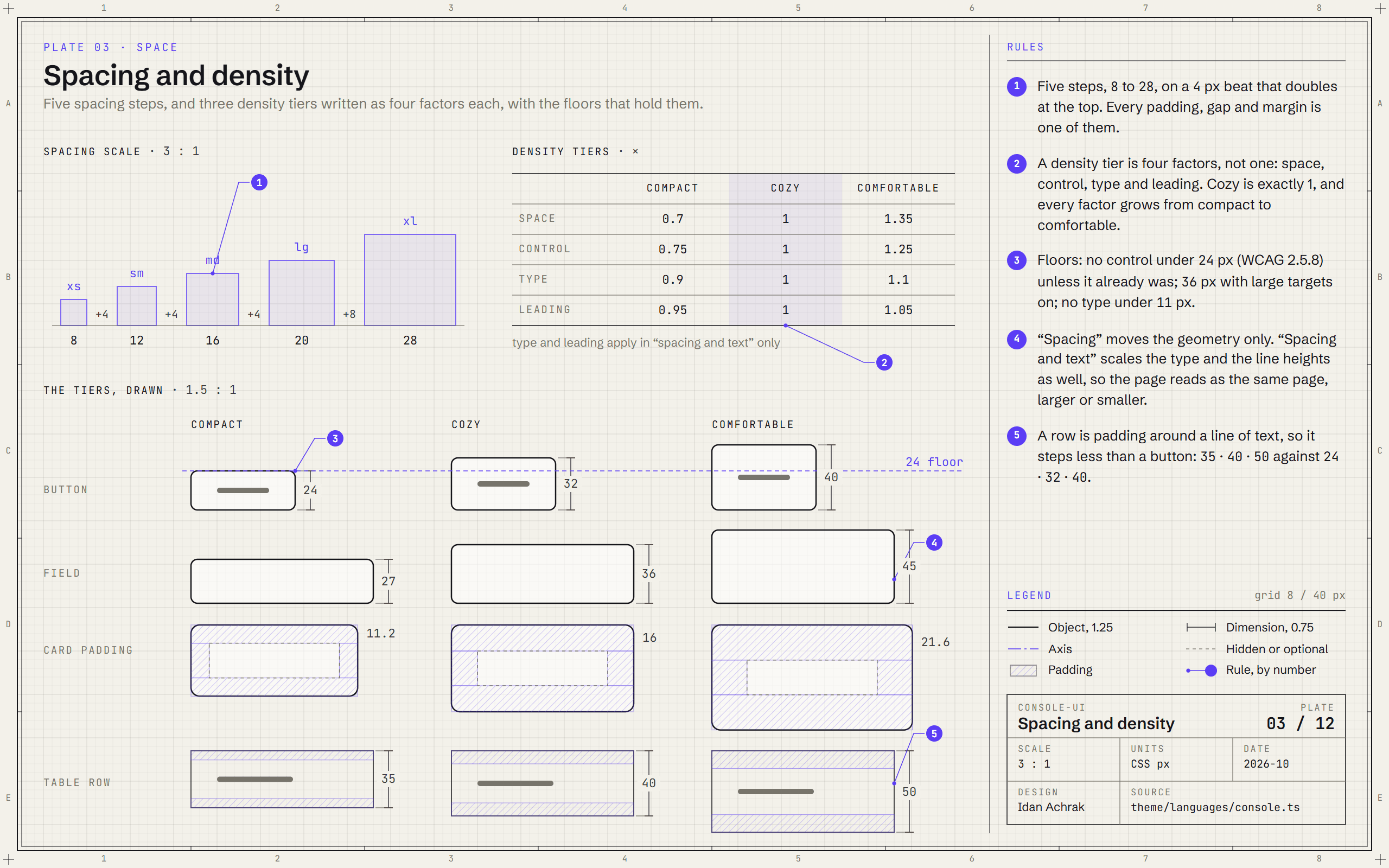
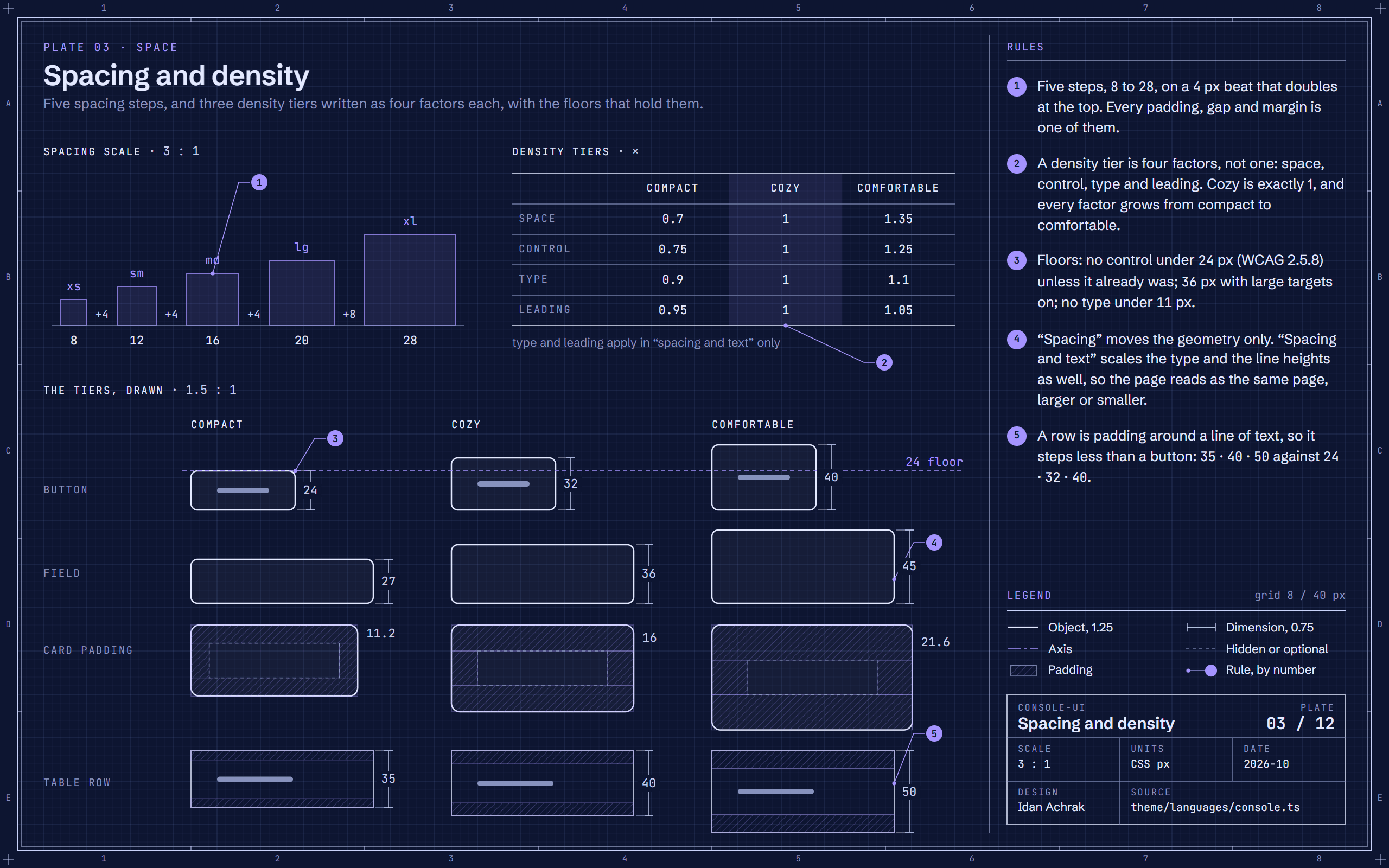
Blueprint of console-ui's spacing scale and density tiers: a factor table and the same button, field, card and table row drawn at compact, cozy and comfortable.Blueprint of console-ui's spacing scale and density tiers: a factor table and the same button, field, card and table row drawn at compact, cozy and comfortable.
Plate 03Spacing and densityFive spacing steps from 8 to 28, and three density tiers that move buttons from 24 to 40 px without ever going under the 24 px floor.
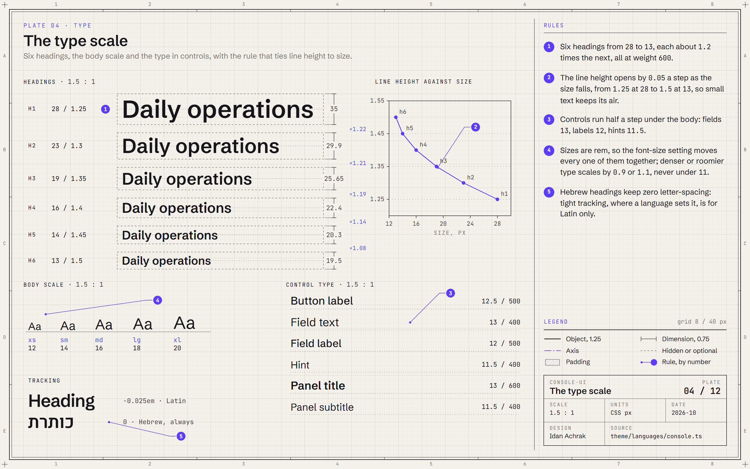
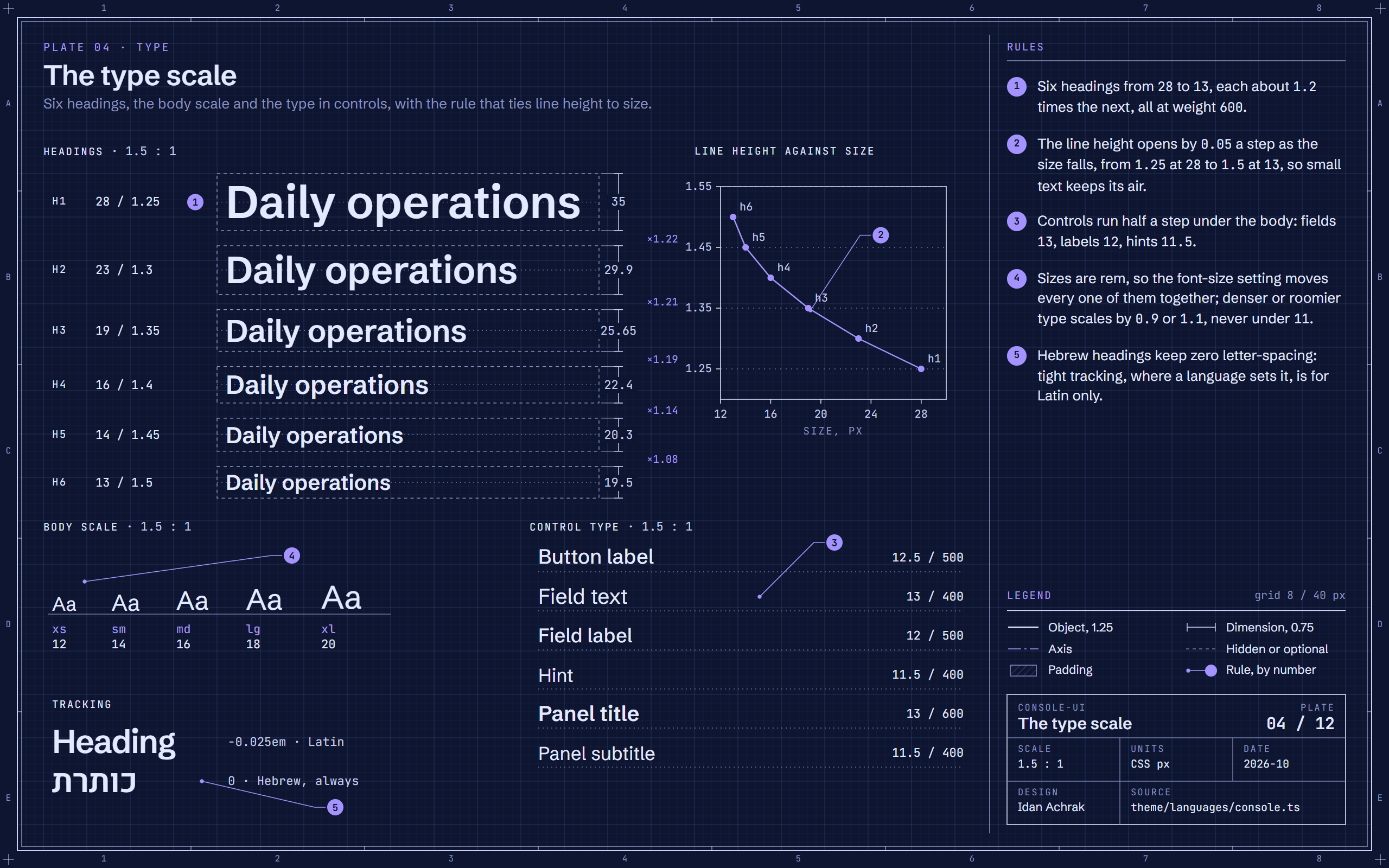
Blueprint of console-ui's type scale: heading specimens in line-height boxes, a plot of line height against size, the body scale and the control type.Blueprint of console-ui's type scale: heading specimens in line-height boxes, a plot of line height against size, the body scale and the control type.
Plate 04The type scaleSix headings from 28 to 13 px, each about 1.2 times the next; the line height opens by 0.05 a step as the size falls.
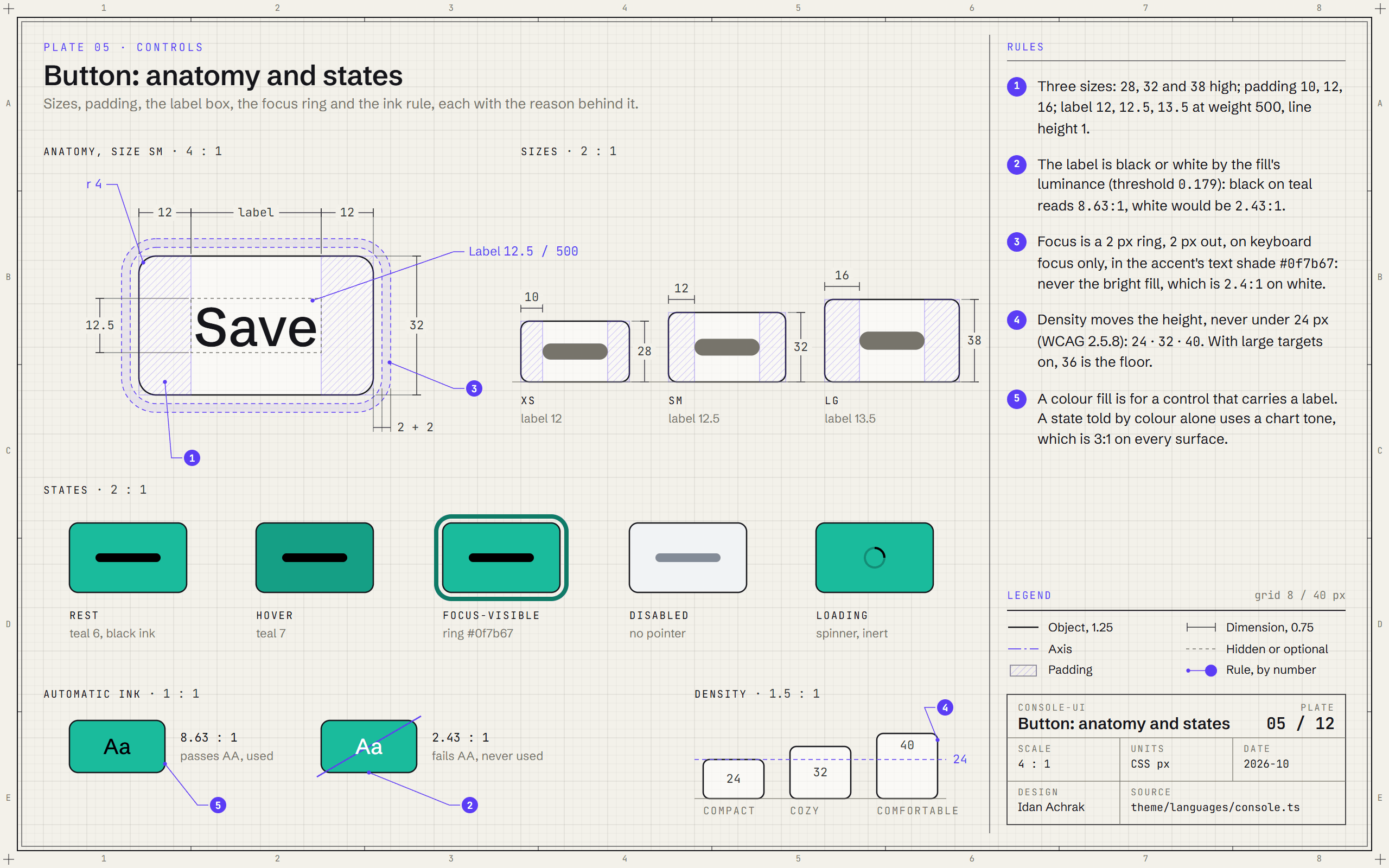
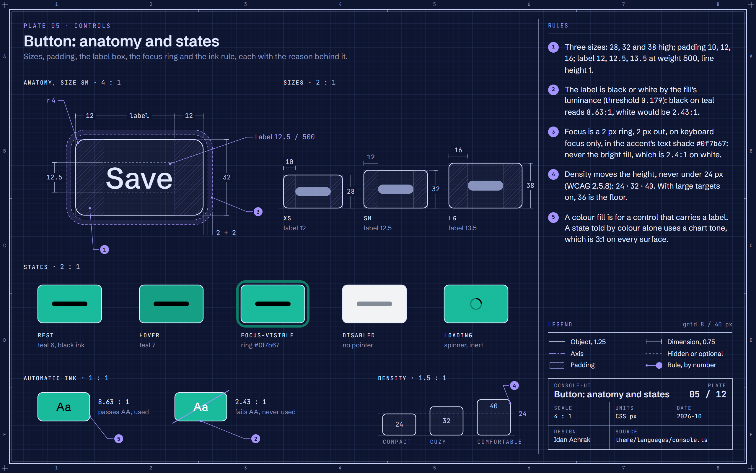
Blueprint of the console-ui button at four times its size, with its padding hatched, the focus ring, its three sizes and five states.Blueprint of the console-ui button at four times its size, with its padding hatched, the focus ring, its three sizes and five states.
Plate 05Button: anatomy and statesThe button, measured: 32 px high with 12 px padding, a 2 px focus ring set 2 px out, and black or white ink picked by the fill's luminance.
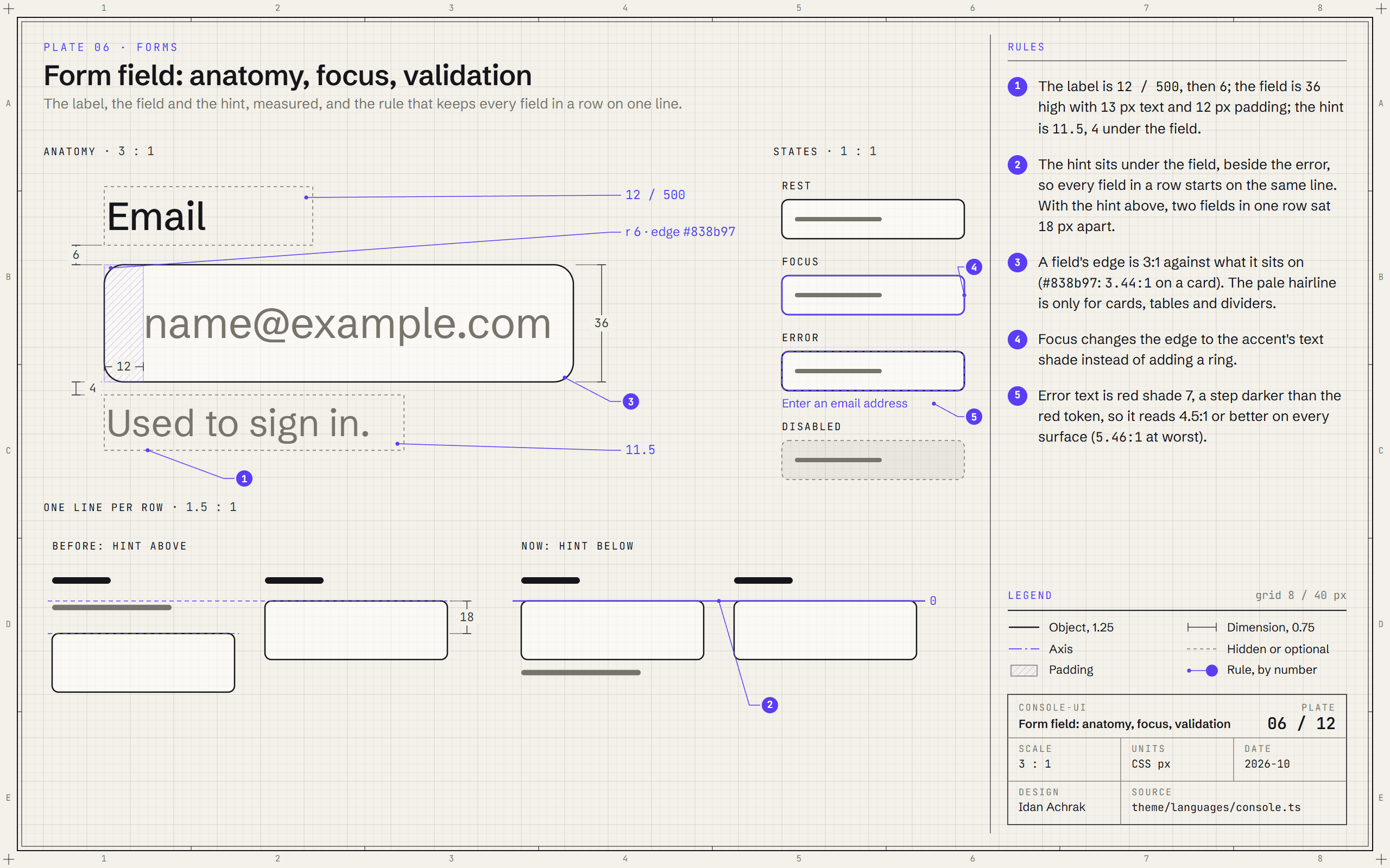
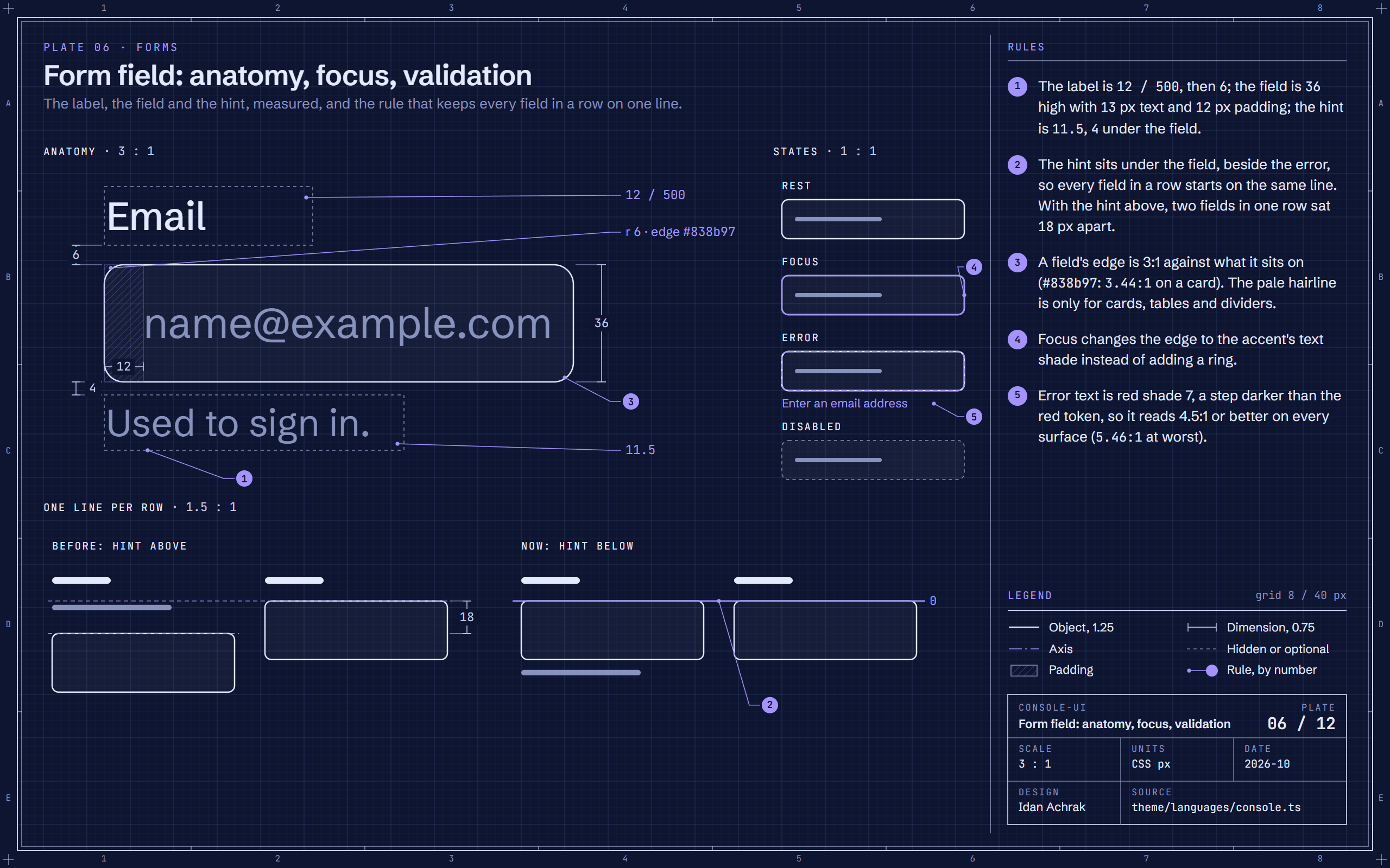
Blueprint of the console-ui form field at three times its size, its four states, and a before-and-after of two fields in one row.Blueprint of the console-ui form field at three times its size, its four states, and a before-and-after of two fields in one row.
Plate 06Form field: anatomy, focus, validationA field is a 12 px label, 6 px, a 36 px field and an 11.5 px hint under it, so every field in a row starts on the same line.
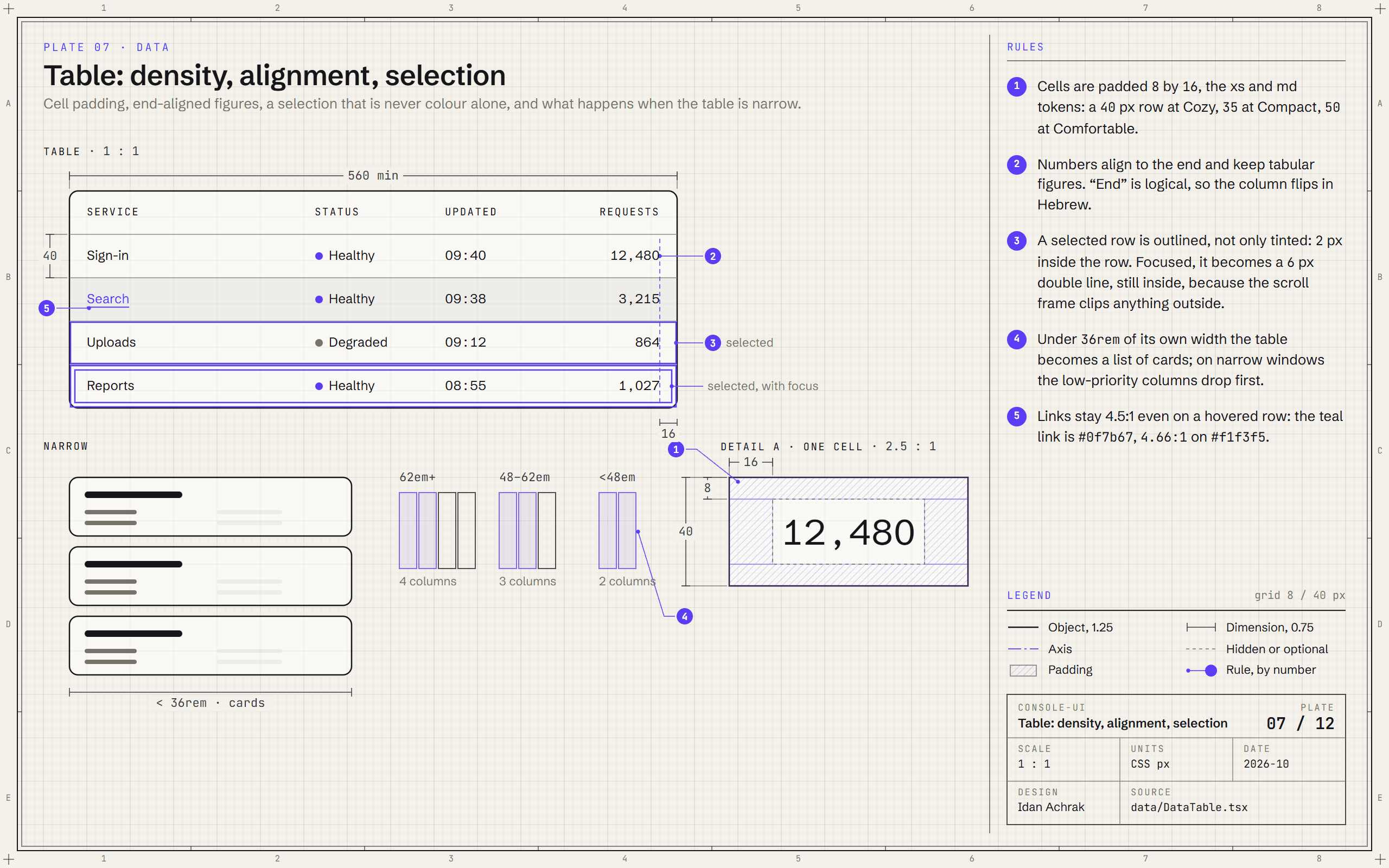
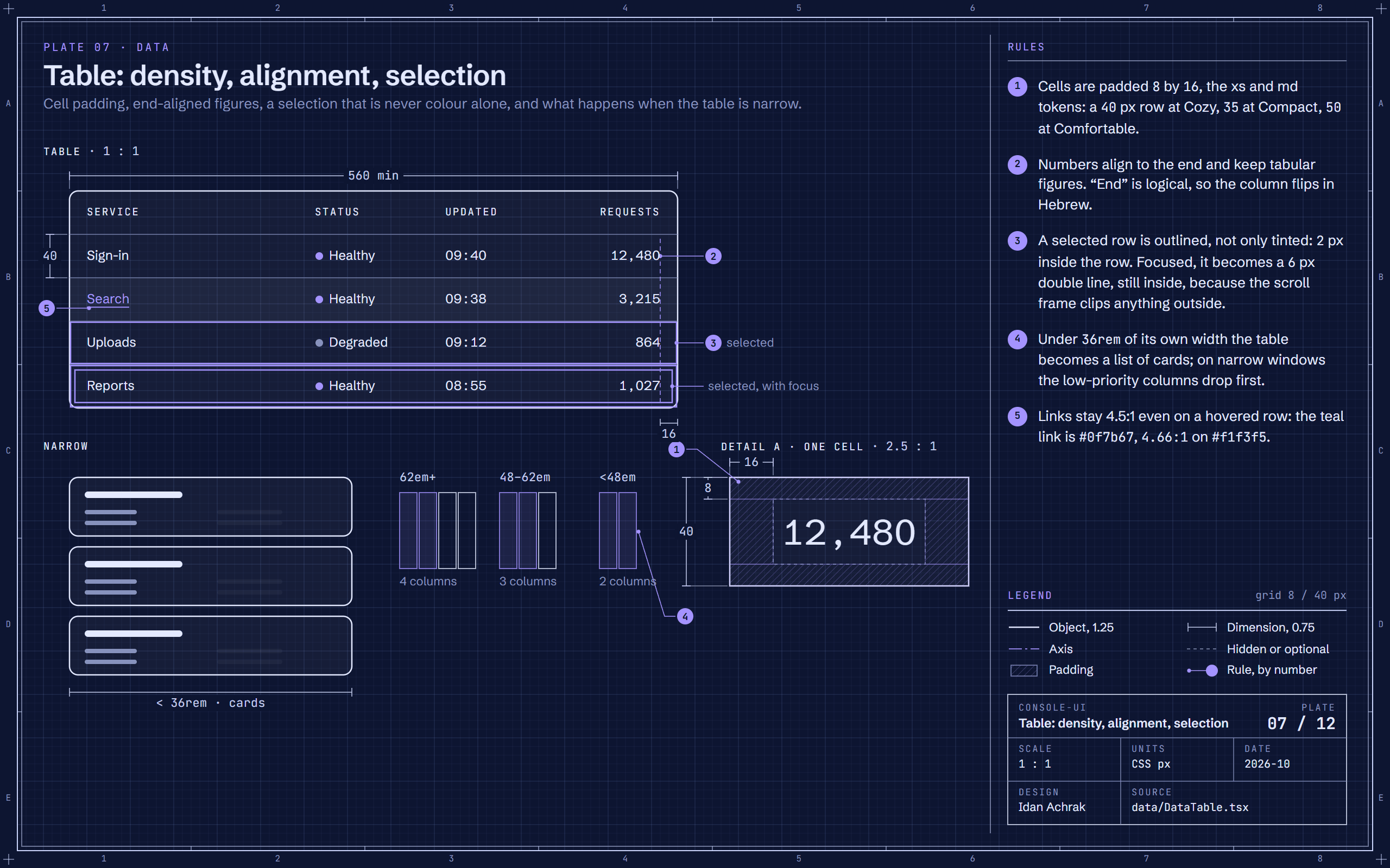
Blueprint of the console-ui data table with a hovered, a selected and a focused row, one cell at three times its size, and the narrow layouts.Blueprint of the console-ui data table with a hovered, a selected and a focused row, one cell at three times its size, and the narrow layouts.
Plate 07Table: density, alignment, selectionA 40 px row from 8 by 16 px padding; numbers align to the end; a selected row is outlined inside, and doubled when it has focus.
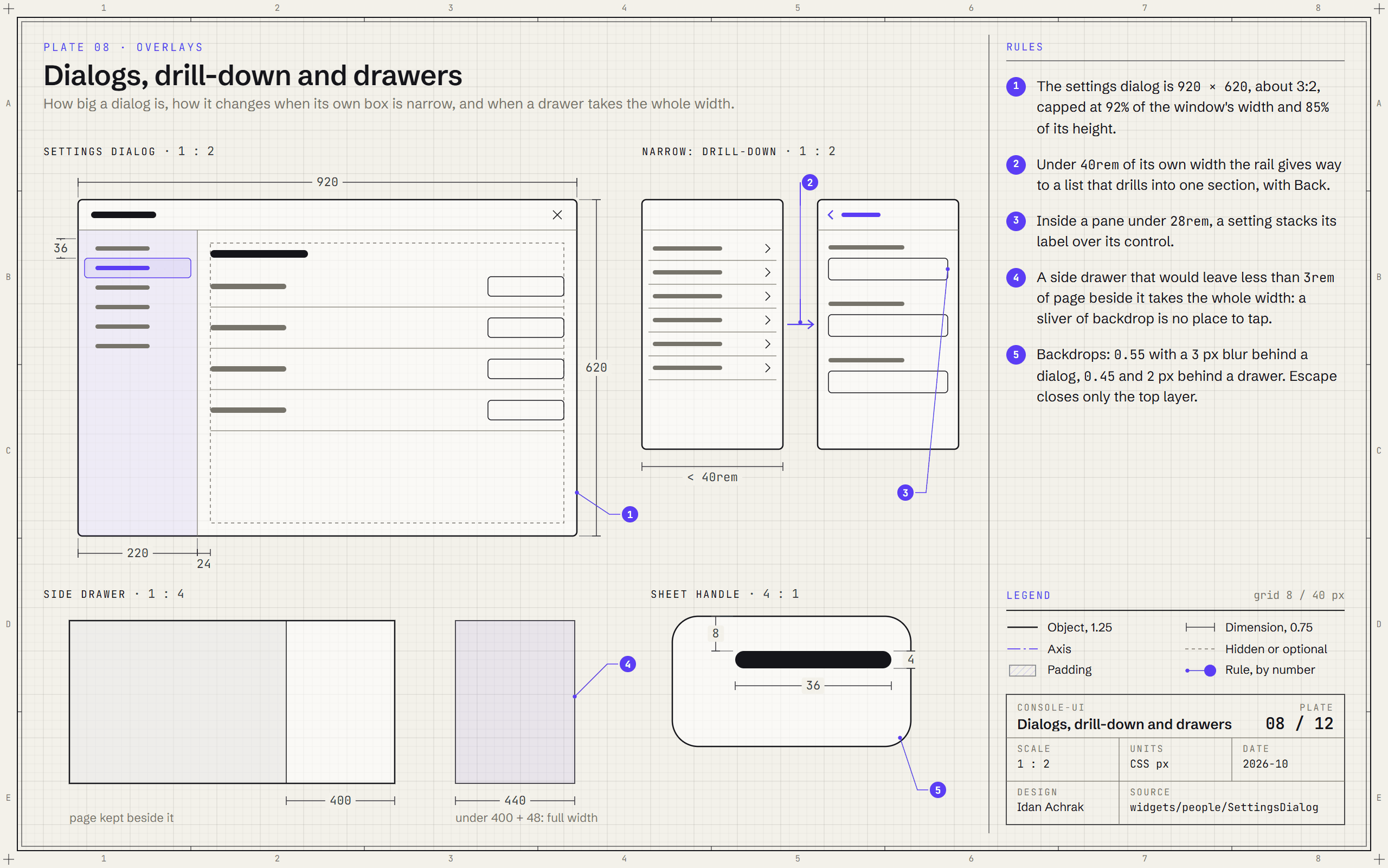
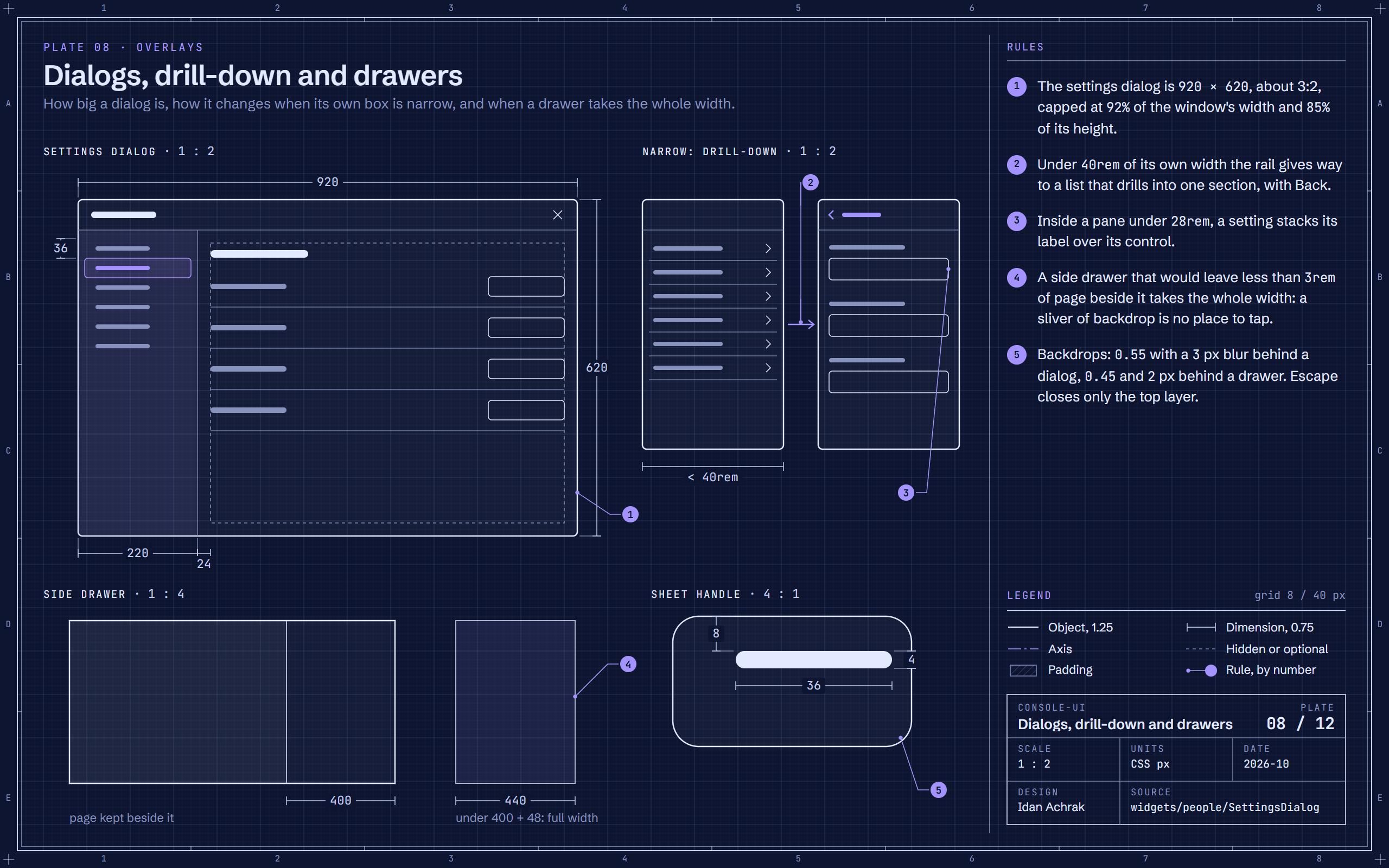
Blueprint of the console-ui settings dialog at half size, its narrow drill-down, a side drawer at two window widths and the bottom sheet's handle.Blueprint of the console-ui settings dialog at half size, its narrow drill-down, a side drawer at two window widths and the bottom sheet's handle.
Plate 08Dialogs, drill-down and drawersThe settings dialog is 920 × 620, capped by the window; under 40rem its rail becomes a list that drills in, and a drawer never leaves a sliver of page.
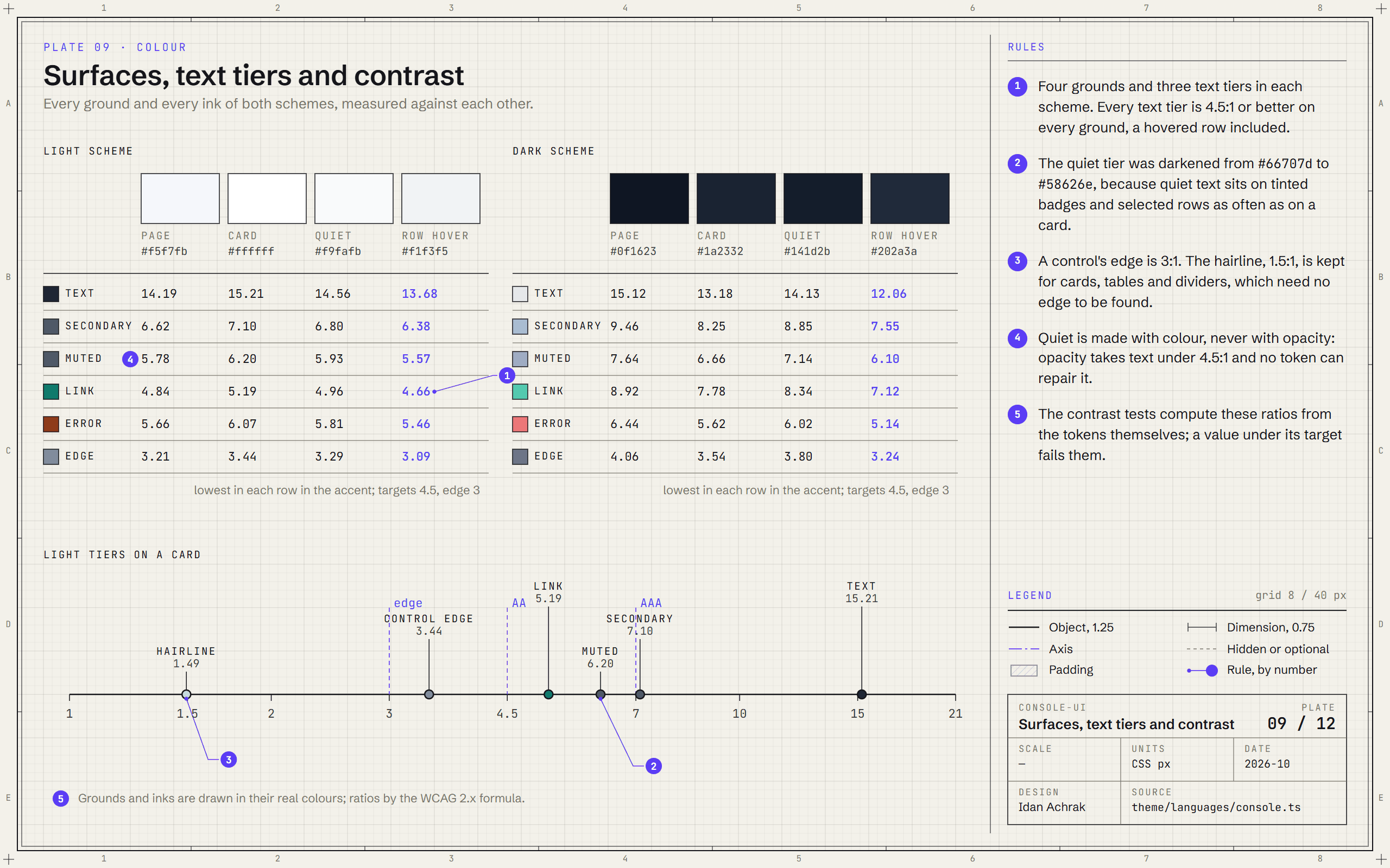
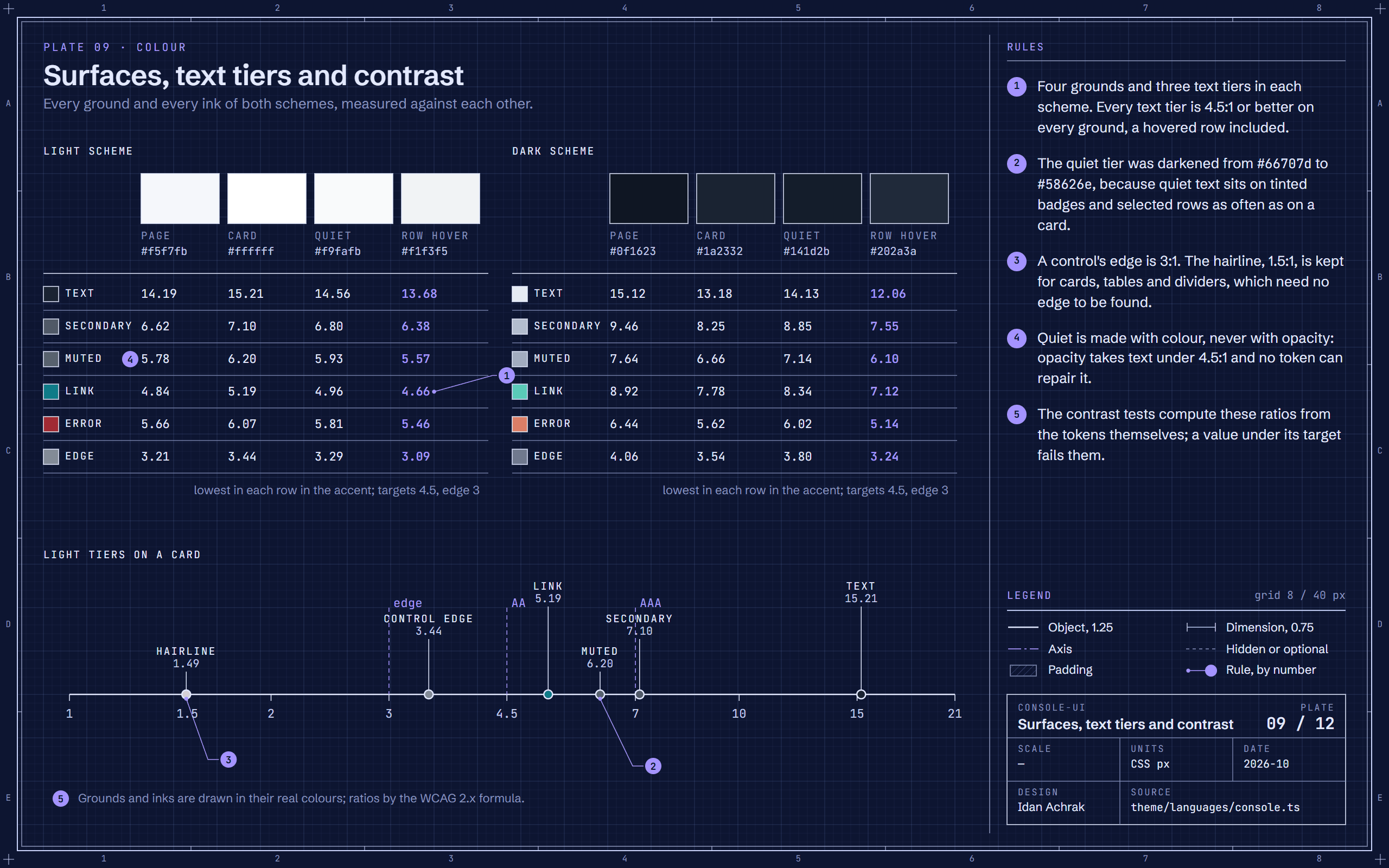
Blueprint of console-ui's colour tokens: the grounds of the light and dark schemes, a matrix of contrast ratios for every text tier, and the light tiers on one contrast scale.Blueprint of console-ui's colour tokens: the grounds of the light and dark schemes, a matrix of contrast ratios for every text tier, and the light tiers on one contrast scale.
Plate 09Surfaces, text tiers and contrastEvery text tier is 4.5:1 or better on every ground, a hovered row included, and every control edge is 3:1: the ratios are computed from the tokens.
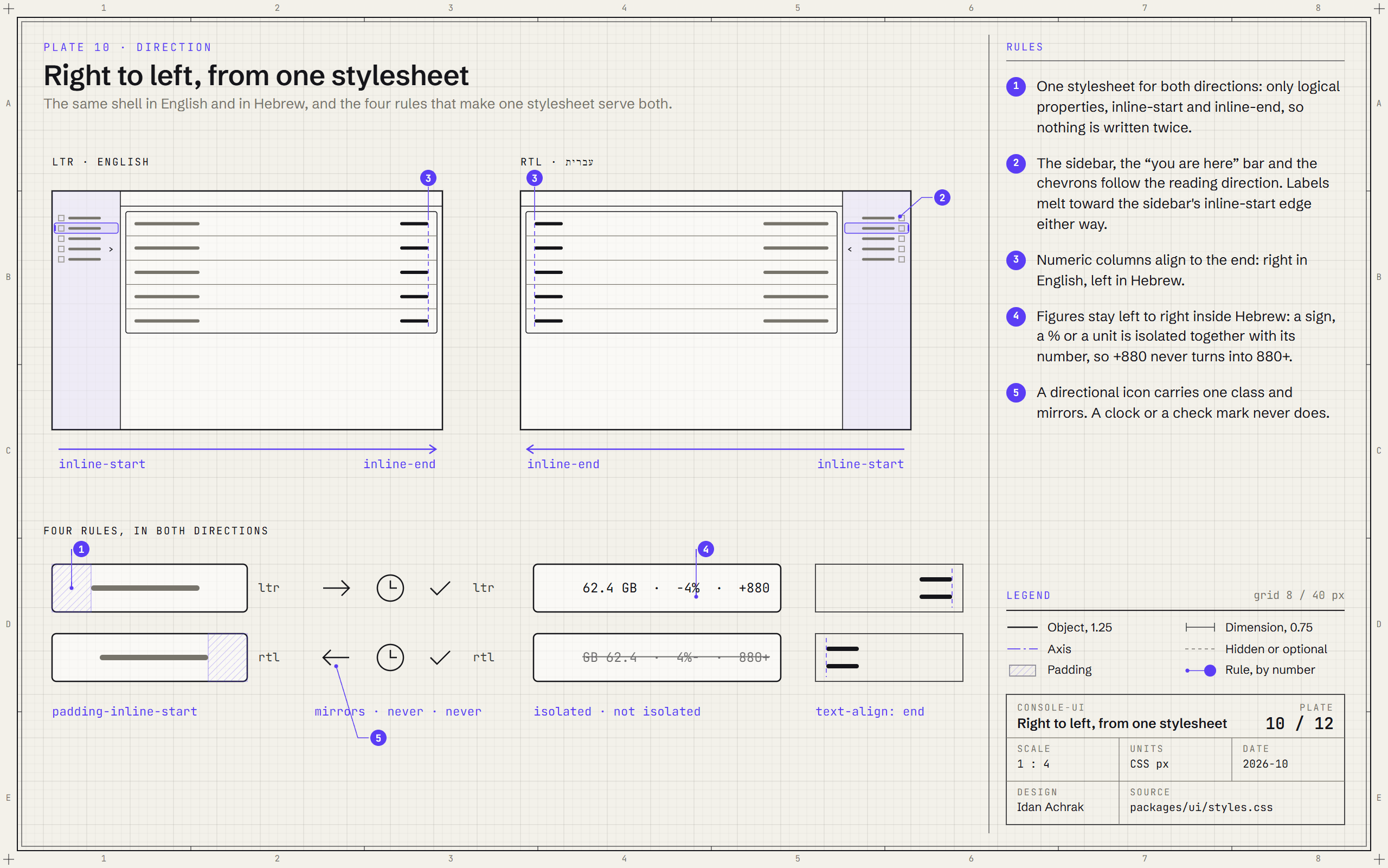
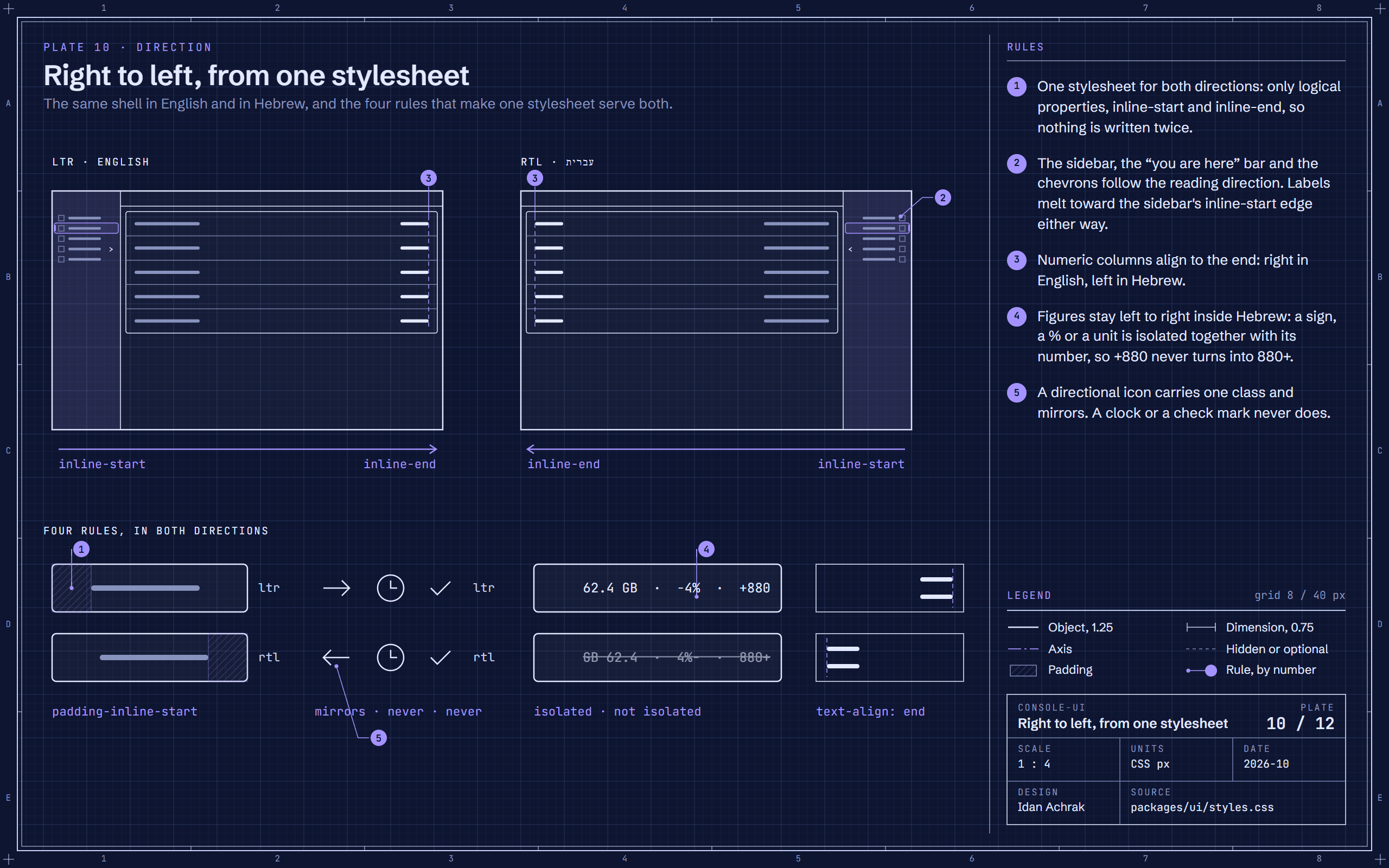
Blueprint of the console-ui shell side by side in left-to-right and right-to-left, with details of padding, icons, figures and alignment in both directions.Blueprint of the console-ui shell side by side in left-to-right and right-to-left, with details of padding, icons, figures and alignment in both directions.
Plate 10Right to left, from one stylesheetOne stylesheet for both directions: logical properties only, end-aligned numbers, isolated figures, and icons that mirror only when they point.
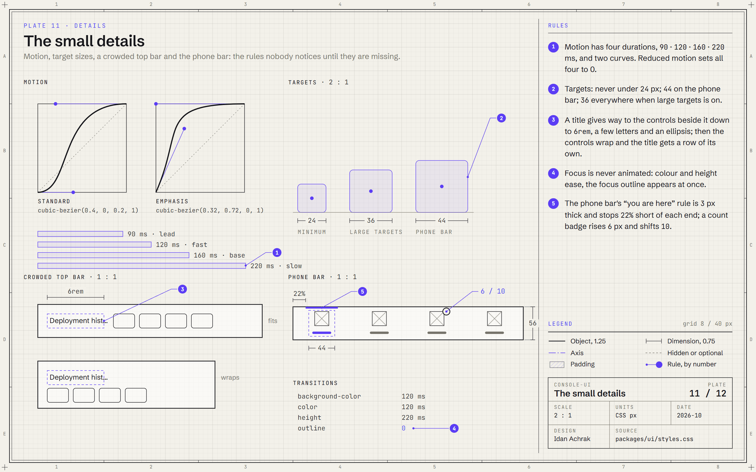
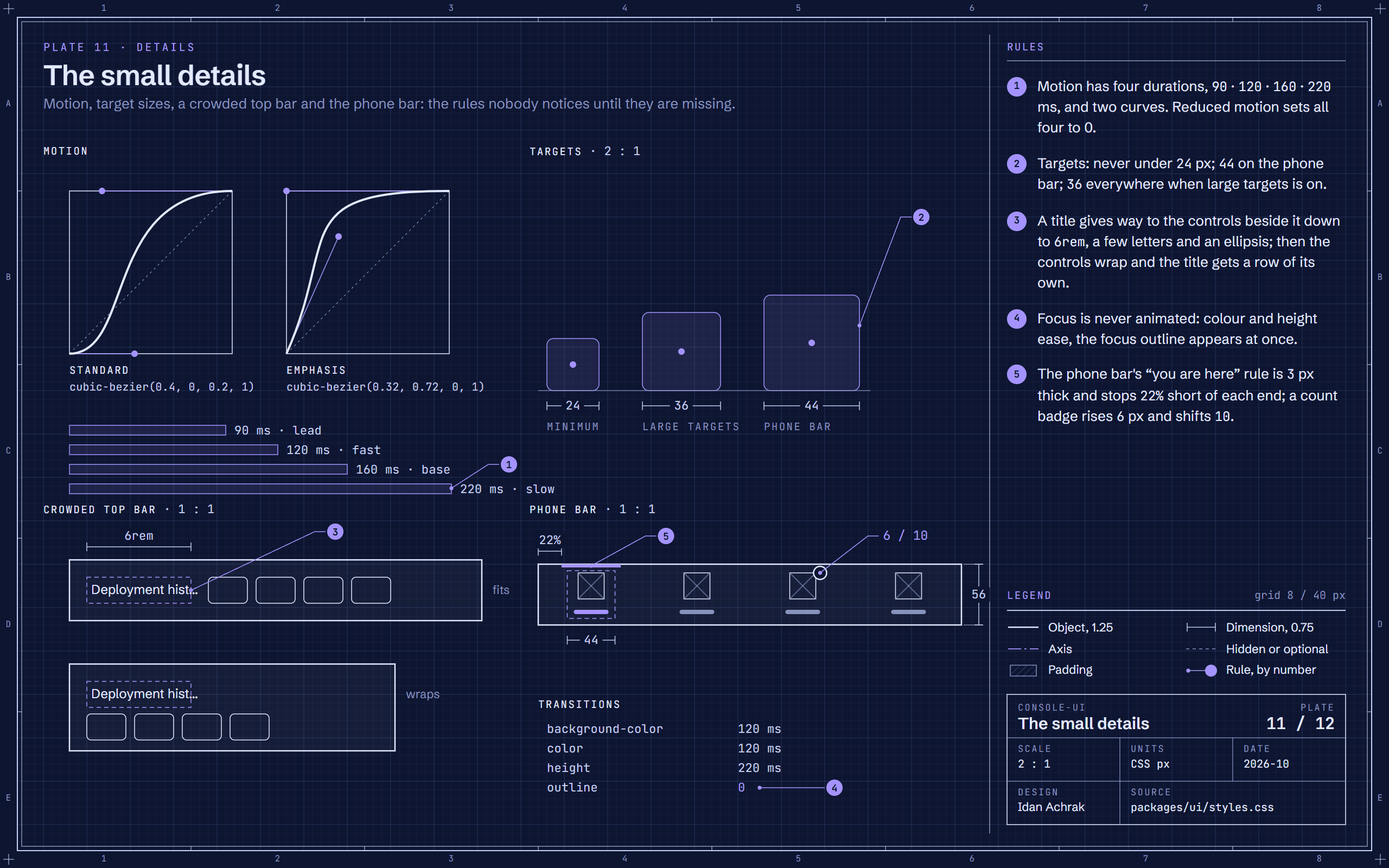
Blueprint of console-ui's small rules: its two easing curves and four durations, three target sizes, a crowded top bar before and after it wraps, and the phone navigation bar.Blueprint of console-ui's small rules: its two easing curves and four durations, three target sizes, a crowded top bar before and after it wraps, and the phone navigation bar.
Plate 11The small detailsFour durations and two curves for all motion, targets of 24, 36 and 44 px, a title that never shrinks below 6rem, and a focus outline that never animates.
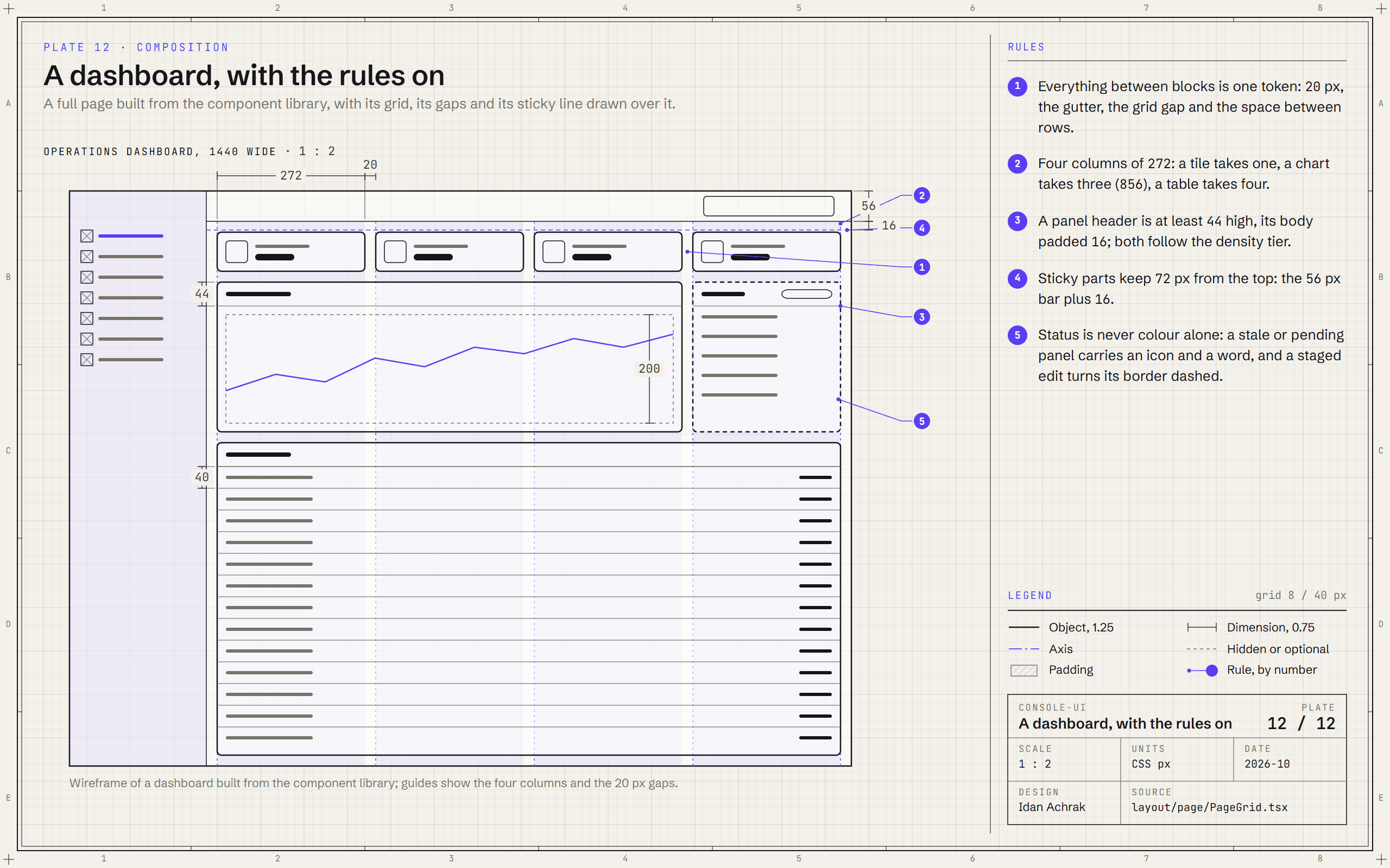
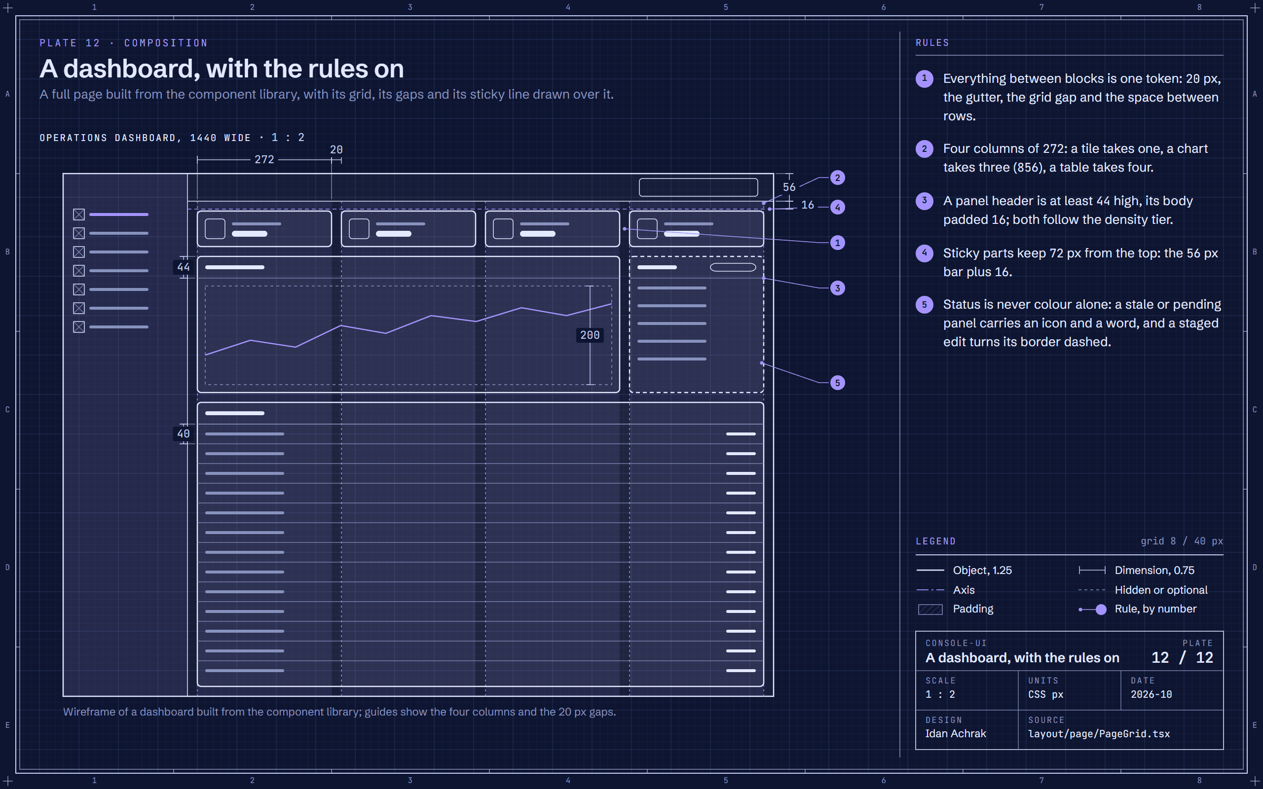
Blueprint of a console-ui dashboard at half size with its four-column grid, 20 px gaps, panel headers, chart area, table rows and sticky line marked.Blueprint of a console-ui dashboard at half size with its four-column grid, 20 px gaps, panel headers, chart area, table rows and sticky line marked.
Plate 12A dashboard, with the rules onA full dashboard on four columns of 272 px: every gap is the same 20 px token, and sticky parts keep 72 px from the top.

05 / Where it stands

2design languages, each light and dark
2directions, Hebrew right to left and English left to right, from the same code
130entries in the live component catalogue

console-ui has been in active development since July 2026, with a catalogue of ready-made components, a theming guide and a testing guide that new screens are built from. Other projects of mine already build their screens on it.

Its browser tests sweep the showcase with an accessibility checker in both design languages, light and dark, left to right and right to left, and many of the rules on the plates are pinned by tests: the contrast ratios, the control floors, the sidebar's axis and the top bar's edges.

06 / Role and tech

It is my own project, and I am its only developer. I decide the rules: the tokens, the scales, the layout and the details, and every ruling is recorded in the repository with its reason.

I build it with Claude Code, from written plans and under my own review: agents write most of the code, and the tests, the audits and the measurements decide what is done.

Tech

  • React 19
  • TypeScript
  • Mantine
  • Vite
  • pnpm
  • Vitest
  • Playwright
  • Design tokens
  • Claude Code

How it's built

React 19 and TypeScript on Mantine 7, in a pnpm workspace with Vite; Vitest for the unit tests and Playwright with an accessibility checker for the browser tests. From July to October 2026 it grew over 327 commits.

Decide a rule once, write down its reason, and let a test hold it.

That is how I like to design.

Chapters